
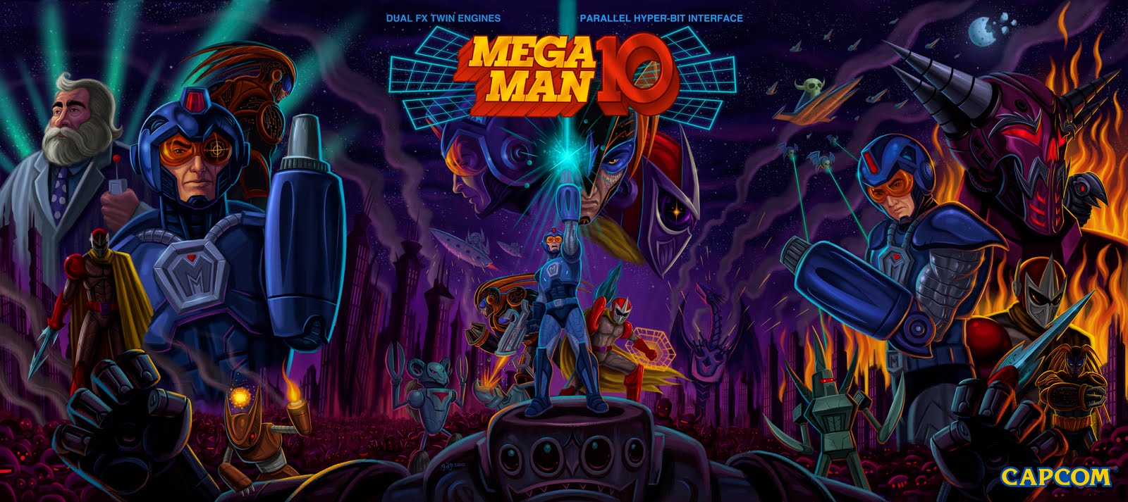
Hey it's been a while! So this is probably old news, but here is the "Mega Man 10" cover I did way back in November. Initially, it was supposed to be three different boxes with each one for the Wii, Playstation 3 and Xbox 360. In the end I wanted to do something on a more ambitious scale and decided to do one huge image, or a tryptic as they say.


So here's how it looks when I start painting! I come from a traditional painting background and I pretty much approach it the same way when I work digitally. I make a layer and just color it with burnt sienna, then I make a layer with my sketch on it and set it to "multiply" and I start my underpainting. This is where most of the heavy lifting is done, just messing with colors, pushing back stuff, bringing it forward. As you can see, my main problem was trying to knock back Proto Man since he was wearing red and thus getting the most attention. So I dimmed his red a bit and also added some rim lighting to Mega Man's body with that obnoxious turquoise color from his laser.

Here you can see some of my sketch showing through and some more progress on the overall painting.

Oh yeah, these paintings were HUGE. Each part of the tryptic had to be 18" x 24" with enough room for bleed. So the final image had to be 55" x 25" at 300 dpi, which is pretty monstrous if you add in all the layers I make in Photoshop. So I had to work on each part of the poster individually and stitch them back together once all the pieces were finished and flattened. I would import a little piece of the finished middle painting into the side I was working on to make sure everything hooked up.

...and here is the finished piece. I was pretty excited when I stitched the whole image all together. This was such a fun and awesome project to work on!
Update: Updated the post with the new version where I added BASS!
5 comments:
Awesome work!!!
I love the "old school NES box art" you did for the 9th and 10th.
(When I was a kid, Megaman2 was one of my favorite box art for the NES)
They did the same for the Japan. They got back to the old Famicom Megaman art. ... But I prefer yours (US version)
fucking amazing
That is just too cool
Great Job man! LOVE this!!
Ooh, that looks pretty cool. Great job I`d say.
Post a Comment